While a thriving community benefits from the economic growth fostered by local restaurants, these public spaces are influential in the socio-cultural aspect of the place. Restaurants are gathering spaces where relationships are formed and memories are made. Moreover, local recipes and products are preserved and experienced by the community.
A restaurant’s ambiance is significant in its success by affecting the overall experience of its customers. LIV Hospitality Design Awards recognizes exceptionally designed spaces in the midst of the food and beverage industry’s evolution, celebrating quality, promoting creativity, and promoting innovations. The following 10 restaurant projects have been awarded by LIV Hospitality Design Awards for their exciting new concepts and strategic design solutions.
Wan Chu-One Avenue by Lu & Yang Design Company.
Designed by Lu & Yang Design Company, Wan Chu-One Avenue is a restaurant in China that embodies the distinct aesthetic and refined beauty of Huizhou culture, craftsmanship, architecture, and art.
Huizhou, which is located in Anhui Province, China’s southernmost province, serves as a bridge between Mount Huangshan and Baiyue Mountain. For centuries, the ancient Huizhou forefathers worked hard to achieve exceptional cultural success in Huizhou’s domains of handicraft, architecture, art, and other creative endeavors. In this enchanted location, Huizhou culture, characterized by its particular style and great refinement, was born. It has a significant impact on human civilization and is a treasure of Chinese culture. Since its beginnings, “Wan Chu” in Huizhou, China, has preserved cultural history and passed on cultural nuances.
To grasp a sense and context of the place, the designer observed the ancient folk villages, spoke with and exchanged ideas with the heirs of intangible cultural heritage, and thoroughly investigated the ancient villages there to uncover tales of grand mansions that were glorious and flourishing in order to reveal Huizhou’s true appearance.
Modern architectural aspects are used as the basis for the design concepts. An old Chinese town was relocated into the city’s core after two years of work to make the concept a reality.
ëlgr Restaurant by Source Interior Brand Architecture
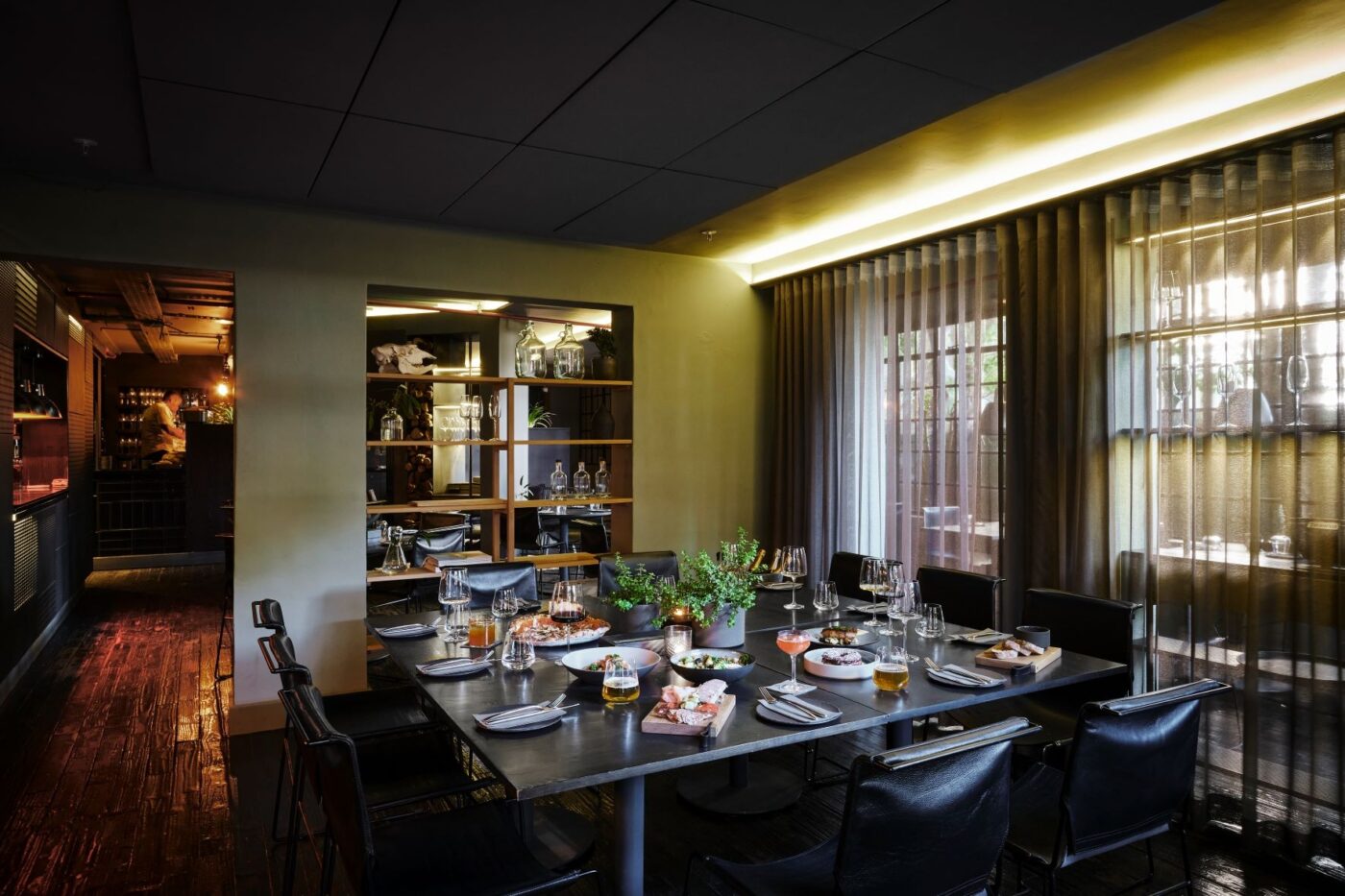
Photo Credit: Sean Gibson
ëlgr from the Old Norse language for moose is a homage to the owner’s Swedish ancestry. The Scandinavian interior with hints of modern geometry offers a calming air to its patrons as it merges wood and metal materials in calming accents such as sage green, charcoal and black hues. Different dining areas integrated inside the restaurant boost the already strikingly beautiful outside. Diners are enticed further into the darker interior of the restaurant, past exquisitely tables with slate dinnerware until they emerge onto a courtyard with a bar, corner couch, café seats and tables, and a pizza oven that is filled with light and plants. There is a location with leather banquettes and aesthetically pleasing curated displays that is right off the street and has plenty of sunlight. Urban, gregarious, and very beautiful.
Nooa by Bishop Design By Paul Bishop
The Nooa which means completely natural is rooted in the goal of creating a unique restaurant space with South African influences. The working concept starts in Rooibos Land, a place where South Africa offers its natural grandeur.
While mostly utilizing natural materials, the design is enhanced using mixed media flooring options. A range of polished and scraped marbles are among these appealing surfaces, which contrast with the wood finishes to create interior spatial zones. Customers find that exploring the restaurant is enjoyable since there is something to be savored in every location because it exudes natural beauty and straightforward design.
The tiled columns are accentuated by creative elaboration that blends natural shapes with something a little more lovely. A portion of the space has red brick brickwork combined with olive paneled wall cladding, dark wood flooring, and multiple gold accents, producing a unique combination of how the different media may be employed. A creative restaurant menu that offers mouthwatering South African cuisine.
Utilizing light and space, the design employs open shelves to allow light and visual continuity. The open shelves are securely held by floor-to-ceiling metal stilts harnessed on the ceiling and securely anchored down creating ample space for display.
Buddha-Bar New York by Yod Design
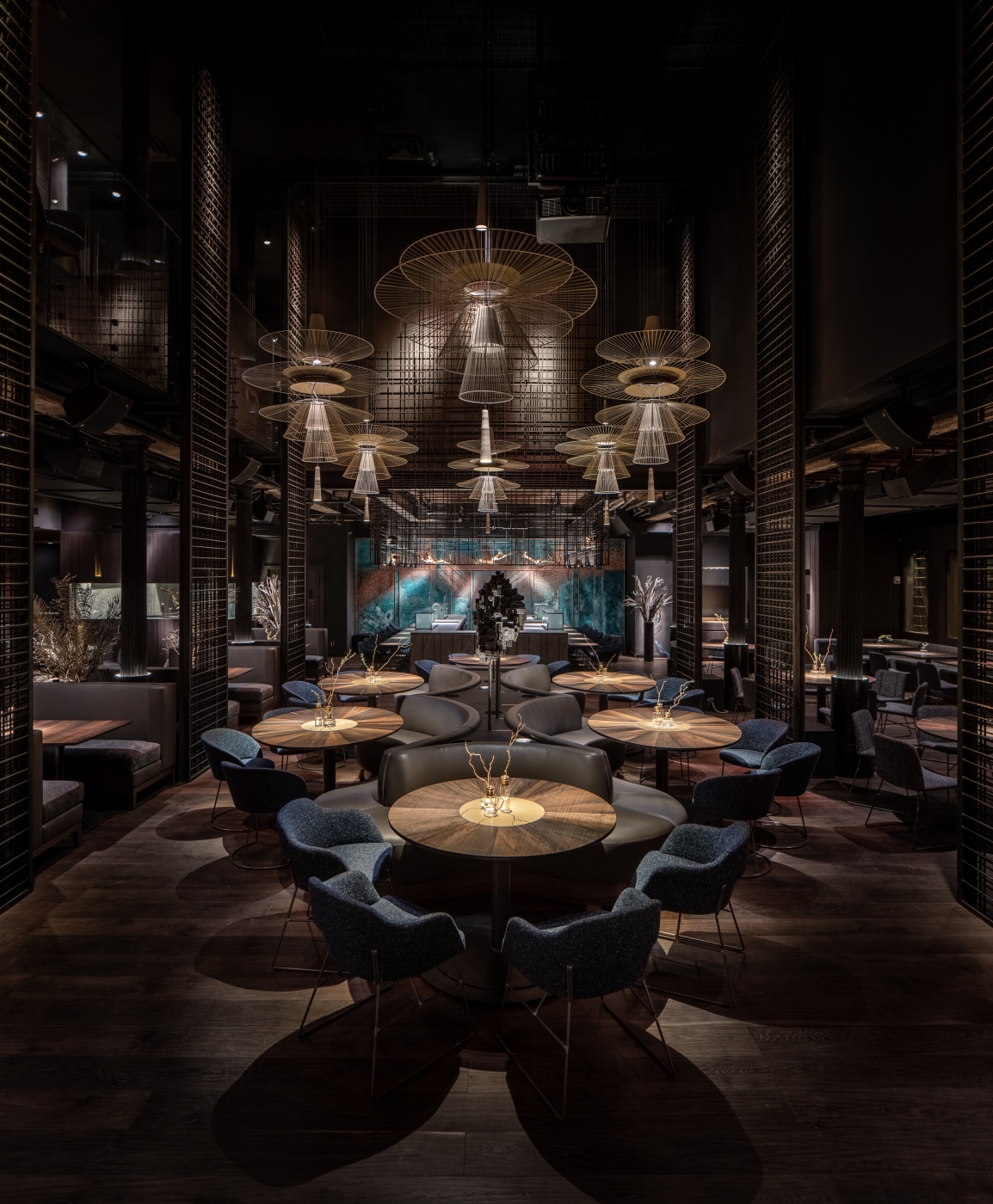
Photo Credit Andriy Bezuglov
Asian food is served in the two-story restaurant Bar New York, which is located in Manhattan’s Tribeca district. The project primarily explores reincarnation as it manifests in the creation of new objects, spaces, and a major brand whose history began with the 1996 launch of the first Buddha Bar in Paris.
In the largest hall, a glass Buddha statue measuring 4.5 meters high is located close to the entrance. To create a futuristic atmosphere, we abandoned the notion of a god composed of the yellow metal. It is made up of roughly 1000 flat parametric parts. The projection of 3-dimensional digital art gives the appearance of a hologram.
The enormous metal pendant lights in the main dining area give an oriental feel, but they are also like some silently hovering drones from the future. The modern integration and the building’s original atmosphere are blended together in the interior’s grays, browns, and blues. We used interior features to convey the rebirth theme. such are dried flora and wood that is 800-4000 years old. The era of New York’s industrial development is reflected in the cast-iron columns, original timbers of the structure, and steel-bar screens.
De Uitsmijter by Apto Architects Bv
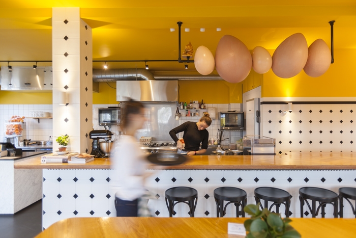
Photo Credit Wim Hanenberg
Dubbed “The Yellow Restaurant”, De Uitsmijter opened its doors in 2020 next to the RAI in Amsterdam Zuid. Inspired by the simplicity of the classic Dutch dish Uitsmijter (“outs-my-ter”). Uitsmijter is simply an open-faced ham, cheese, and egg sandwich. It is comparable to the French croque madam, but it is not at all mistaken for being delicate because it contains white bread and at least three eggs.
The cuisine concept pays homage to the traditional Dutch dish with the same name by exclusively serving uitsmijters. De Uitsmijter is available to everyone, whether they are young or elderly, together or alone, working professionals or tourists, unlike other one-product ideas. Living in your parents’ house is reflected in the interior decor. consuming a healthy dinner at the kitchen table following a late-night outing or taking the family to breakfast on Sunday. Pure nostalgia in an opulent, contemporary atmosphere.
Order at the bar and pay directly. If you are in a rush, eat your uitsmijter standing at the bar, just like in France or Spain. If you want to stay a bit longer and watch some show cooking, you can take place in the ‘kitchen’. If you need a bit more quietness you can walk into the back part of the café. Work, meet, or relax. Just eat at your own pace, it’s up to you!
Taste of Dadong • Rhapsody, Shanghai by AD Architecture
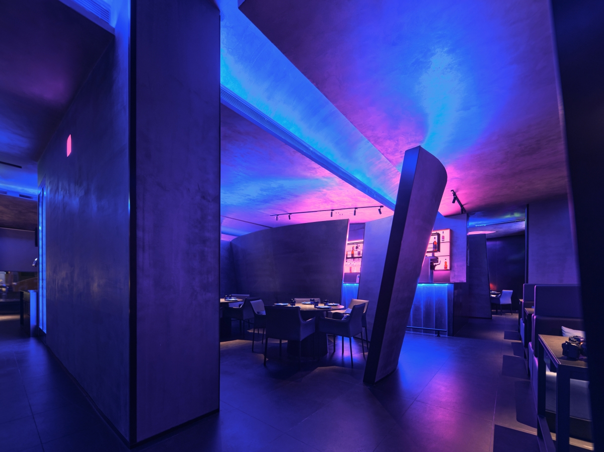
Photo Credit yuuuunstudio
A rhapsody in color and light, the Taste of Dadong in Shanghai is designed to create a mood that elates the emotions, ideas, and resonance in a social setting.
The Taste of Dadong is an offshoot of the already well-known Da Dong restaurants, the sub-brand aimed to have a more subtle and relaxing vibe in the dining experience. Designed by AD Architecture it explores cool and psychedelic tunes to give the illusion of entering a new dimension.
The modern aesthetics with abstract forms and irregular routes blur away boundaries and spaces. The entrance is quite obscure as it creates a meandering path and the wall-to-ceiling curved partitions and circular dining tables create intimate spaces for smaller groups. The patrons can opt for the booths that are strategically located throughout the dining space.
The invigorating play of light and shadow comes from the LED panels, seeping through the walls and the added mirrored ceiling bounces reflections which add to the dreamy quality of the space. Adding the cosmic quality is the bluish tint juxtaposed with the fuchsia-pink glow installed behind a faux skylight above the eating areas and seating booths. The bar radiates the fuchsia hue behind the open shelving, highlighting the area and creating an interesting blend of the blue and pink hues that reflects on the architectural surfaces.
The best restaurants transport you to another location. Places where you suspend disbelief and embark on a trip to a place you have never been. Creating a succession of rooms that complement the experience of a fantastic restaurant operator is truly the core motivation behind any successful restaurant design. Additionally, these are locations where communal meals and culture are discussed. One of the best cities in the world for international eating in Melbourne. Its restaurants provide a wide range of cuisines. One of the newest places that showcase this fantastic eating tradition is Yakimono.
Yakimono welcomes guests with giant graphic signs and enormous orbs, channeling the future mood of Japanese anime and movies like Blade Runner 2049 and Ghost in the Shell.
Min Food by Bigsense Design Studio
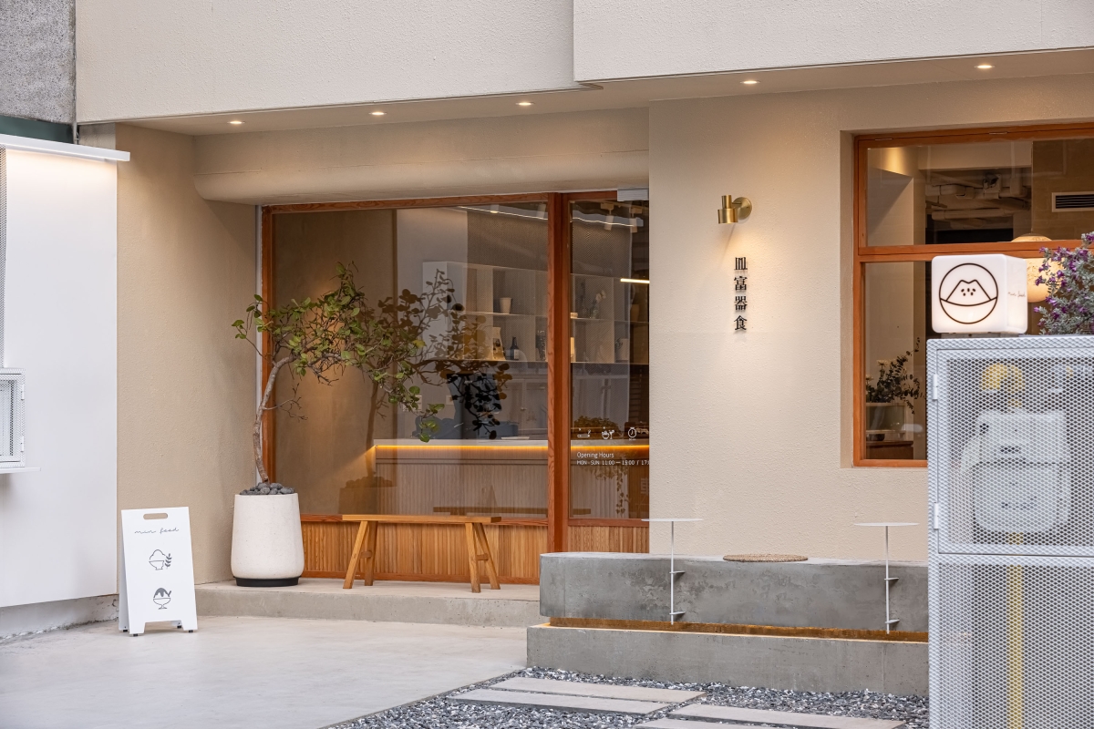
Photo Credit Bigsense Design Studio
Min Food is a space of simplicity and deep respect for organic sensations. In order to merge Japanese and Western flair, the design emphasizes the texture of objects and creates an atmosphere with natural coatings, wood, and foreign furniture. The brand promotes “finding beauty in life via the eating experience” and has a basic aesthetic.
In order to provide a welcome open area for the community, the walls surrounding the perimeter were demolished. A desaturated color palette enables seasonal design changes, and plenty of greenery and vacant spaces highlight the antique house’s true beauty. The movement flows inside the area are organized, and a sizable part of wood and decorations offer a sustainable design and sensory experience.
In order to enhance return visits and stickiness, perspective is used to create layered scenes through diverse materials, artifacts from various time periods and places, and natural light exhibits aesthetic diversity and gives each seat its own ambiance.
Perspective is employed to create layered scenes that encourage repeat visits and stickiness; different materials, relics from many eras and locations, and natural light showcase aesthetic diversity and give each seat a unique mood.
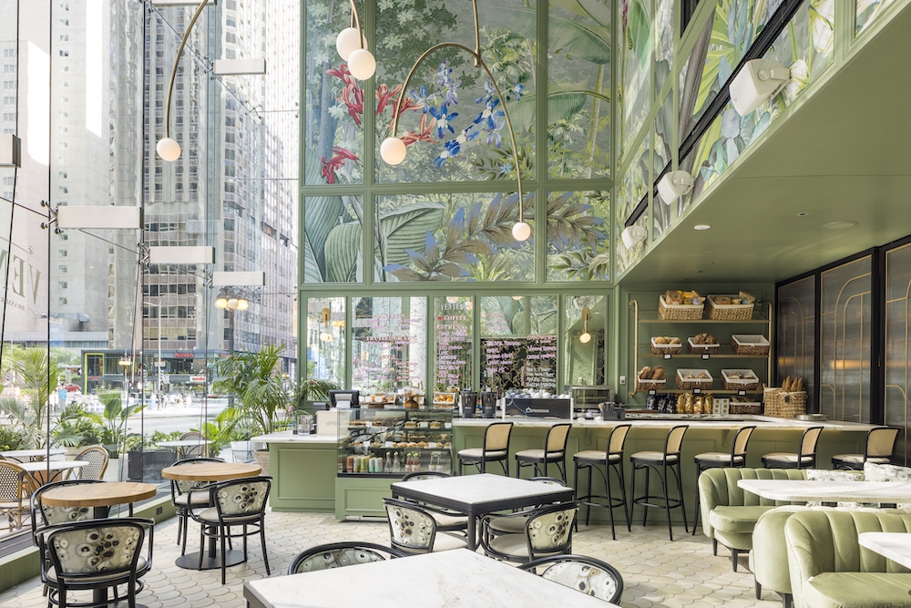
Photo Credit Neil Burger and Jacob Hand
The Venteux is a chic and charming brasserie situated in Chicago’s famous Magnificent Mile Carbide & Carbon skyscraper. Donald Young, the city’s youngest chef to receive a MICHELIN Star, runs Venteux. To create Venteux, Young and national hospitality pioneer, Clique Hospitality, enlisted renowned design firm Studio Munge to completely transform the existing 4,000 sq. ft. restaurant area into two distinct gastronomic experiences that both honor the love of high living of the French.
With a color scheme of sage green, cream, and terracotta, Venteux’s cozy café area exudes romance. Design features include an enormous brass pendant lamp, exquisite moldings, flecked gold antique mirrors, and flowery fabrics. Sunlight pours through the lofty 40-ft. Visitors may relax in one of the soft velvet booths or marble-topped tables, which are surrounded by large windows and rich flora paintings on the walls. A large bar spans the length of the unusual dining area in the gleaming brasserie, which also has chairs covered in rich burgundy velvet, old Persian carpets, and elements like expressive stones, cognac leather, and oak wood.
Miss Miu by Krucker Partner AG
In the restaurant, a young Korean lady named “Miu” who joined a traveling circus in Seoul in the 1980s and swiftly rose to prominence with her burlesque performances, is shown in a fictionalized manner. The Miss Miu visitors are taken into a Mystical Circus World between burlesque and “Naughty Korea.”
The use of a circus tent to bridge the facade-separated interior and outdoor spaces in this project was significant difficulty in maintaining the space’s unity. The front of the building was intended to physically melt and flow within, merging the interior and outside worlds. Other dedicated all-weather spaces were made utilizing snug circus wagons and trailers in addition to the circus tent.
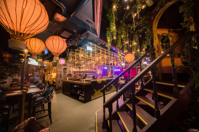
There are several fun areas spread around the restaurant. The authentically recreated BBQ Street offers a variety of sensual experiences, including a carousel lounge with floating balloons, a bus stop in Gangnam that serves as a waiting area for takeout, a self-order station turned gaming salon, a small shop, a knife-throwing wall for photos, the circus tent with a stage where guests can enjoy exciting burlesque performances, or you can simply go on a sensual journey of experience there.